Apples and Bananners!


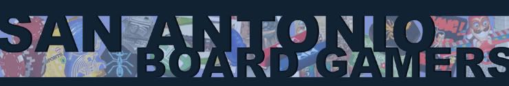
Above are two of the logo ideas I've got at the moment. Of course everything is subject to change from colors to game clutter, tagline, etc. Feedback welcome; in fact I implore it. I prefer the bottom one since it is a bit cleaner and blends in better with the look of the site. Any other ideas you've got are welcome as well.
posted by Simon @ 11:56 PM
19 comments
![]()
![]()


19 Comments:
Looks great!
It's now the banner. I need to monkey with the template code this evening to get the rounded corners out of there.
I did a direct link to Photobucket, so if you update the file there, it should automatically update the site as long as the filename doesn't change.
Actually, it might line up with the overall look of the site better if you scaled the graphic size to match the width of the link column on the right side (i.e. approximate 20% size reduction).
Argh! It's huge! I'll be monkeying with some other ideas also, so if it changes periodically, don't be alarmed.
If you could actually get rid of the header box, it blends right into the background. I think you should be able to resize a href img's too, but I could be wrong.
OK, I made the changes myself since they were pretty easy. I went with a cleaner design too. I plan on changing the game clutter in the background so there isn't as much dead space behind the text. I also need to resize the banner by about 20 pixels...but progress has been made!
I'll be back in later. Break time.
Thanks for working on this. I think the graphic really takes this website to the next leve.
I can tell you know a lot more about HTML than I do. If I can't plagiarize the code, I'm practically clueless.
level
I vote for the top one. I like being able to see the dragon, counters, meeple, etc.
Top one. Painted dragon mini though?
Other taglines:
"trading sheep for wood since 2005"
"rolling dice since..."
"chunking it since..."
"grilling meeples for dinner since..."
"growing indigo, corn, and coffee since..."
"meeples, colonists, invaders,(whatever other stereotypical game character) all welcome"
"alamo city's meeples"
Ok, I don't feel like working.
That looks smooth Simon. Good job. I think someone should come up with a better slogan though. It probably won't be me though...
I agree with Patrick.
You know what... the blue dragon next to the yellow meeple looks good as it is.
Simon's slogan actually gave me a pretty good laugh.
Wow. So much talent in this group. I like the newer banner, but it's too bad that it makes the bits so much harder to identify; working out which game each one came from is fun. (BTW, That's not a standard Carc meeple is it?)
Perhaps we could rotate taglines. Rob has several good ideas.
The current tagline is pretty funny, but I wonder if it's only really funny to the in-group. If you weren't a gamer, I wonder if you'd know what a "meeple" is.
What about a very simple tagline like: "Playing games and making friends since 2005".
I admit it's not too funny and it's not exactly catchy, but it's very descriptive and straightforward.
Boo boo Ted.... too serious.
Kidding. It's a good idea too.
Carcassonne the city has those meeples.
And yes, I laughed too, and immediately tried to come up with a cleverer thing to do with meeples. You are still winning.
Similar to my wood and sheep trading tagline...
http://www.boardgamegeek.com/image/112022
I like Ted's kinder, gentler slogan.
It's tough coming up with something that appeals to both grognards and euro-geeks. The best I could come up with was, "Cry havoc, and let slip the Meeples of War!"
It's hard to read the text of the lower banner. You need to make the text white instead of grey, I think.
[Posted for Jacqui]
Ted: "The current tagline is pretty funny, but I wonder if it's only really funny to the in-group. If you weren't a gamer, I wonder if you'd know what a "meeple" is."
Isn't that a bit of a red herring seeing as anyone using the site is going to either be a member, interested gamer, or current gamer...?
In any case, the tagline is certainly up for discussion. I just added in what came off the top of my head to show its placement.
I also didn't use any gray on either banner...so I'm confused there. I'm up at College Station at the moment so I'll do the following upon my (triumphant) return:
1) Resize
2) Change tagline
3) Reduce opacity
4) Improve game clutter
5) Other stuff I can't think of...
Peace.
I guess I was thinking the tagline for the web page would become sort of our club motto. It might eventually show up on flyers and such.
In any case, the banner looks really cool, and I think I speak for everyone when I say we appreciate your work.
Post a Comment
<< Home