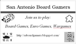
First Shot at Club Business Cards
 Okay, this is kind of ugly, but it's my first shot at a card to advertise our group and hopefully attract more members. As previously discussed, I'm thinking of printing something like this out on business card stock and setting the cards on the table inside the front door of Dragon's Lair.
Oh, this is just a screenshot out of MS Word, so the red underlining on "Wargames" wouldn't appear.
Feedback or artistic improvements welcome!


14 Comments:
It was about a year ago that I made a post on BGG saying I was moving to San Antonio and asking about gamers in the area. Now just look at us. Amazing.
I just need to take my games more seriously and show up to play more often...
Regarding the card, Ben you rock! That first draft is way cool. The one comment I have is that it might be too busy: too many different pictures.
Kudos to Ben for the blog and the card design.
Silly Word. Of course 'wargame,' 'boardgame,' and 'cardplay' are all one word! This letter to Microsoft is writing itself!
I'll email you my take on the card Ben. I'm guessing we are going B&W for costs, yes?
Cost is a factor, but not a huge one since I don't think we'll produce a great number of cards.
I didn't invest a huge amount of time (i.e. 30 minutes) in the design, so I kept coordinating colors a low priority. Plus, like Ted said, I was afraid color would make it too busy.
Looks good, Ben! However, I think the line/stripe is adding to the busy-ness. I like the idea of the pictures. The wargame counter and the meeple will be eye-catching to those two sub-groups of gamers, I think.
Good feedback. I'll take another shot at it tonight.
The wargame counter is from AH's Panzer Blitz, one of my favorites. I played my copy until the mapboard literally fell apart when I was in high school.
I took a few mintues to play around and came up with my own early take:
http://i32.photobucket.com/albums/d33/insertcleverthing/SABG_Cardcopy.jpg
Thoughts?
ughhh...wtf mate?
http://i32.photobucket.com/albums/
d33/insertcleverthing/SABG_Cardcopy.jpg
Copy and paste I guess...I'm glad only three html tags are allowed. Very functional.
*shakes head*
Wow! I'm very impressed. Dude, you've got skills.
We need a wall-sized full poster of this we can hang in Dragon's Lair in one of the rooms.
As far as business cards go, I don't know how good this design is going to look printed out on my inkjet though...
Also, perhaps we can use a version of this (in it's full color mode) as the banner graphic for this web site.
Nothing like Photoshop. Cool stuff. Good call on including a HotS block. hehe
The doom figure should be one of your painted figures though (although on the B&W version like this one it may not make that much of a difference).
Rob, it's also a Wizard Kings block (though at a different strength).
I'm glad you like it as it was hastily thrown together. There's plenty of little graphical flaws if you look close enough. I'd be happy to make a cleaner version though...
Blog banner sounds interesting. I'll keep ya updated.
It may not show up on the card (you'd have to shrink it) but consider adding the "Wargames" card from Twilight Struggle. Pretty much says it all, don't you think?
But the current card is nice.
Brian, count me in for a future game of TS. I'm tired of listening to Joe Stedman and reading Chris Farrell's high regards for that game (and yours too of course).
Wouldn't a slogan look cool too? Cheesy example... "got meeple?"
I'll bring my copy of Twilight Struggle next week as well. I'm thinking of adding blue and red gems to my copy to better mark who controls which countries. Now if I could find a little red and a little blue rocket ship for the space race track...
Even better,...
http://www.boardgamegeek.com/image/118879
Post a Comment
<< Home